Designing Game Icons
Designing Game Icons
Game icons are square images which should quickly convey the meaning and style of your game. The following tips will help you produce eye-catching icons that look great and attract players.
Icon Size
Game icons must be square with maximum dimensions of 512×512 pixels. Uploaded icons will be scaled down to smaller sizes throughout the Roblox site and app. An example is the Games page which displays icons at 150×150 pixels or smaller.
Composition
The icon is the first experience many players will have with your game, so it’s a very important marketing tool. Here are a few example icons which have been carefully composed to express a certain vibe:
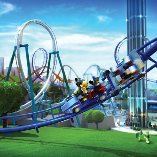
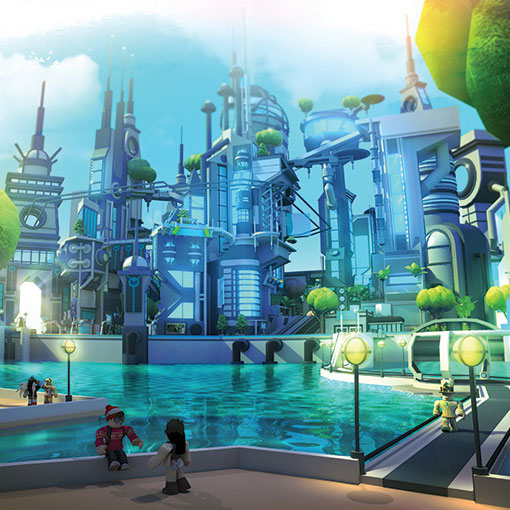
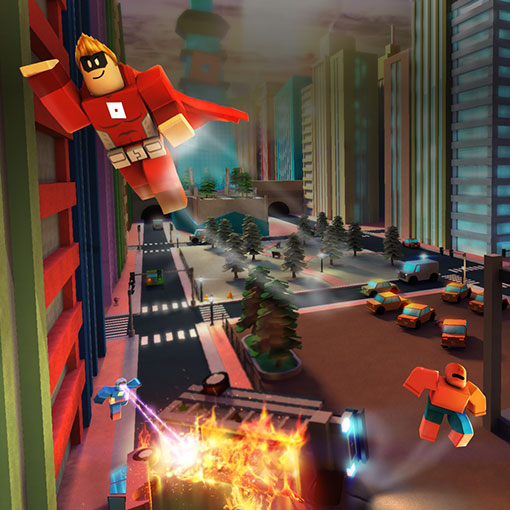
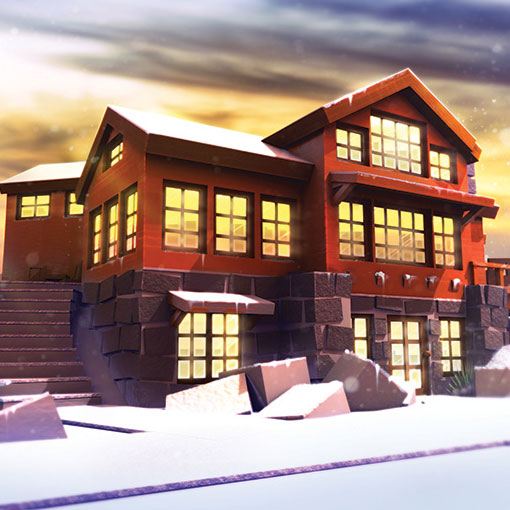
Coloring
Using the right colors for your icon is an easy way to express the core vibe of the game.
Saturation
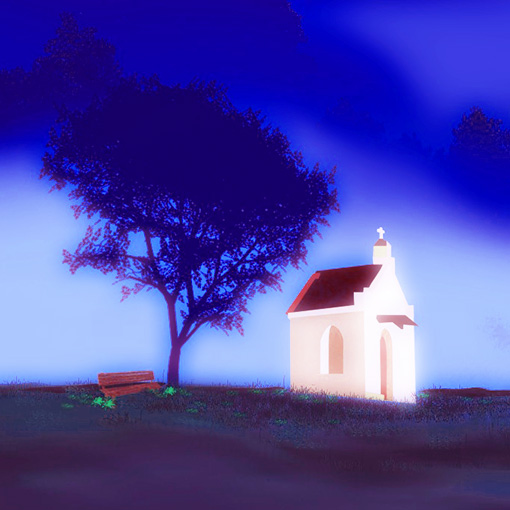
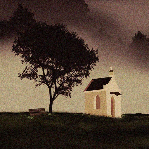
Highly saturated colors can make a game icon look dream-like, while lower saturation can express a more somber tone.
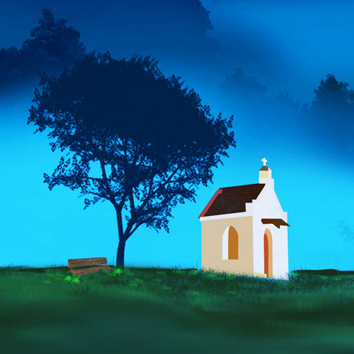
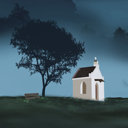
Contrast
You should showcase your game icon in its most brilliant, viewable state. Images with low contrast often look “washed out” while images with excessive contrast can look fake and unattractive.
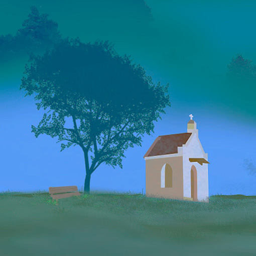
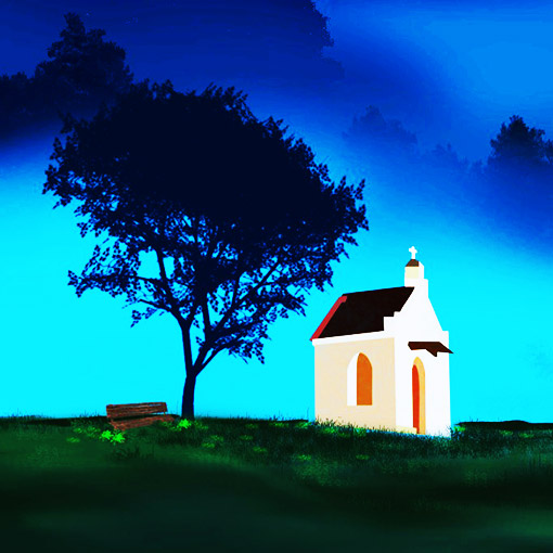
Final Treatment
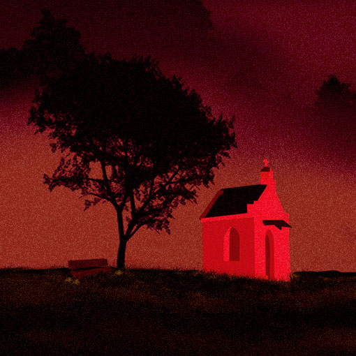
A treatment or “filtering pass” is a global effect that’s applied to evoke a specific tone. This can drastically change the viewer’s feeling about your game.
Fonts
Fonts are very important — they can even become part of your game’s identity. Consider these guidelines when selecting a font for icon text:
- Selecting the correct font for icon text will make the overall composition more appealing to players.
- All-lowercase fonts are pleasant while ALL-UPPERCASE fonts are more direct and may appear to be “shouted.”
- A bold font is often used for stronger emphasis and to attract attention.
- Varying font weights, sizes, and styles are a creative way to enhance game icons.
Discouraged Practices
All developers should avoid the following practices to make sure their game icon follows Roblox’s standards and terms of service.
